Charisma
Charisma – a design that evokes the atmosphere of a coffee plantation!
We’d like to share the process behind developing the packaging design and graphics for the Czech coffee brand Charisma by co-bean. The design reveals the secrets that make this coffee exceptional.
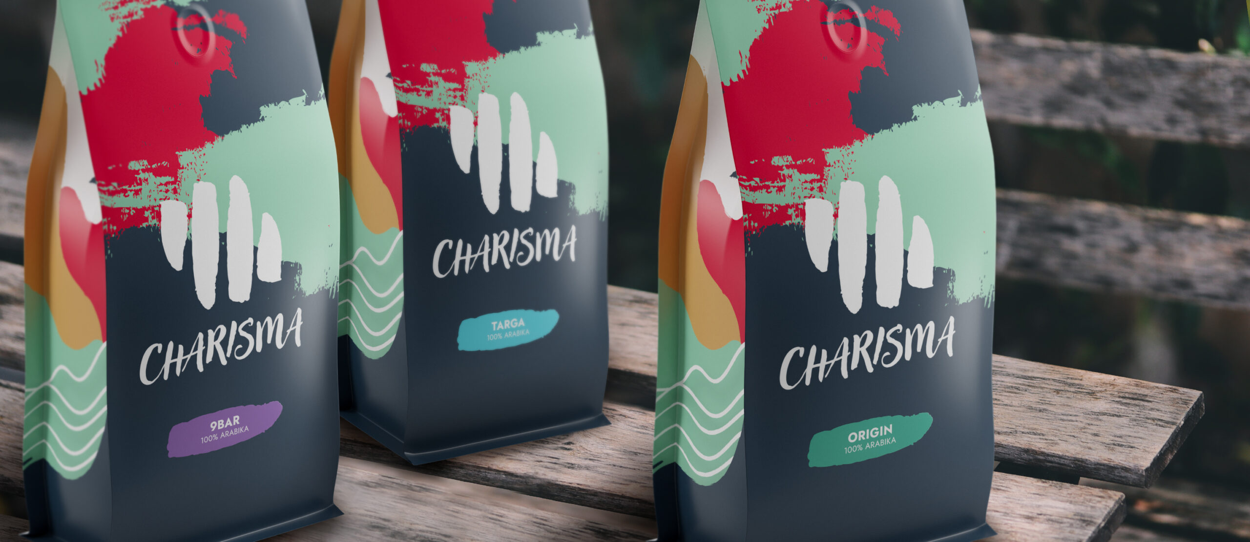
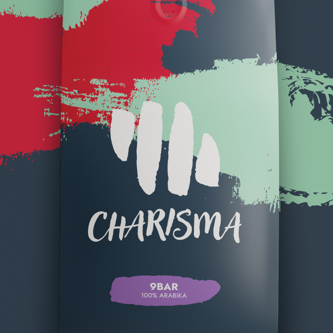
As part of our design process, we integrated the calligraphy from the logo into abstract shapes, giving the packaging a unique character and dynamic feel. The motif on the side of the package depicts coffee plantations, emphasizing authenticity. Co-bean places strong emphasis on selecting green coffee with a clear origin and prefers small-scale farmers with high-quality processing.
Our choice of color palette, including the white logo, brings freshness, modernity, and elegance to the design. A colored label with the coffee name draws attention and supports easy recognition. The refreshed Charisma logo symbol, complemented by new typography, ensures the brand remains relevant and visually appealing in a competitive market.
This design process is driven by the goal of creating packaging that is not only aesthetically pleasing but also functional—appealing to coffee lovers and enhancing their experience with every cup.