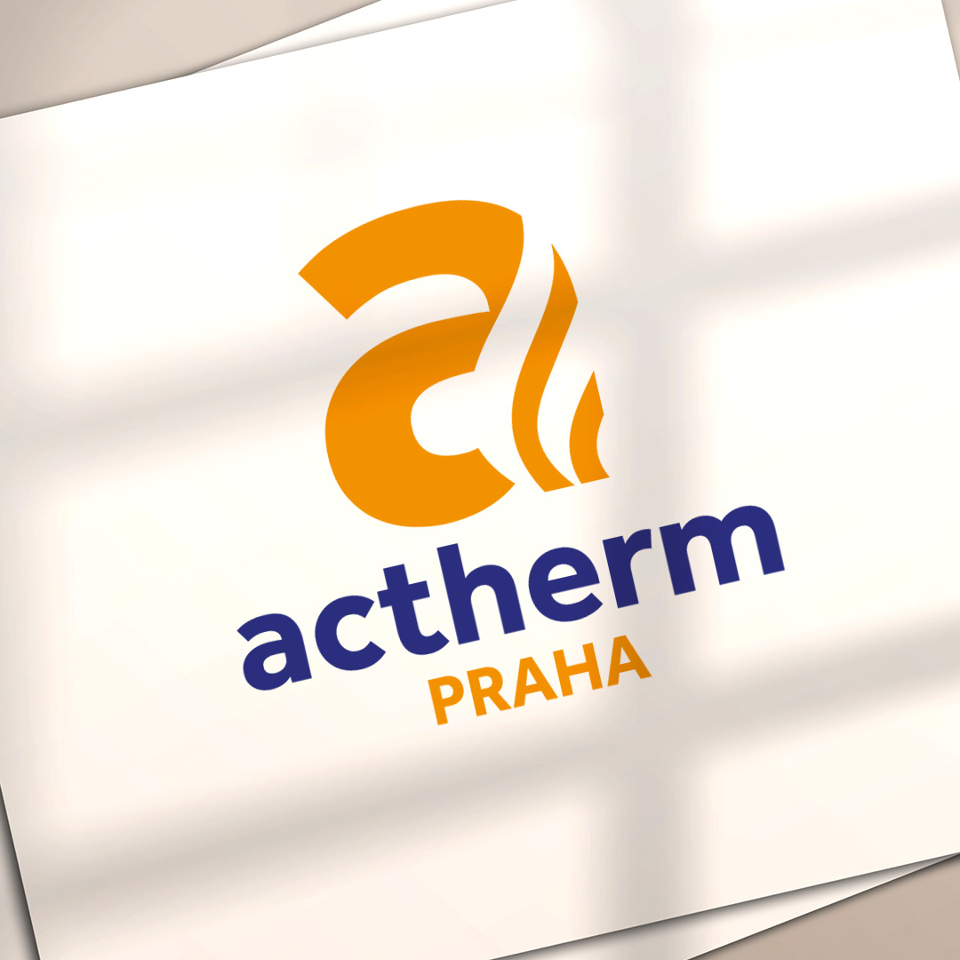
New logotype for ACTHERM Praha
Client: ACTHERM Praha
Type: Branding
New logotype for ACTHERM Praha: The logo, formed by the initial letter “a” with stylized flames, evokes warmth and energy—an ideal symbol for a company engaged in heat distribution.

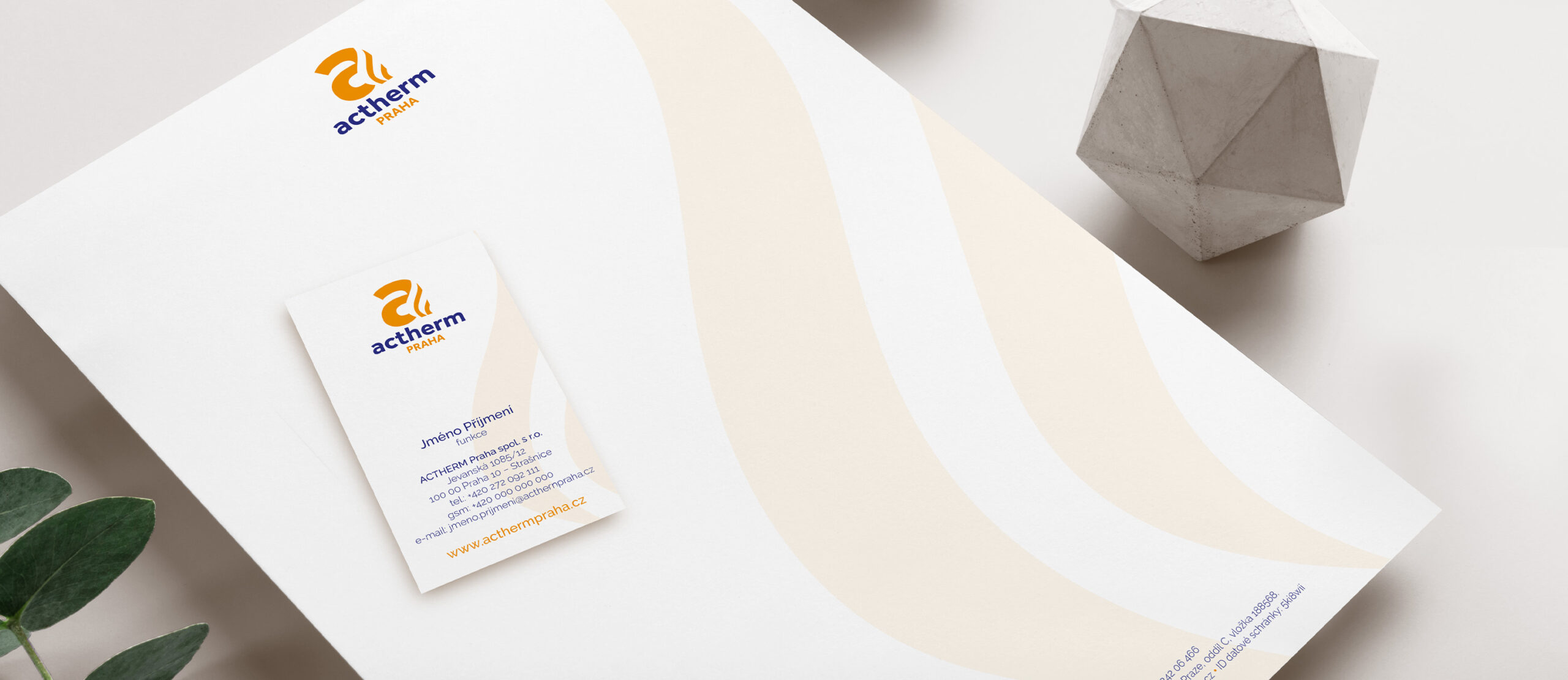
In addition to the logo, we also designed the website and leaflets, carrying the same essence throughout. The residential and corporate segments are distinguished by color schemes and different types of mugs; one is held by a woman in a sweater, the other by a manager in a suit. This contrast not only captures attention but also illustrates how ACTHERM Praha brings comfort and warmth to both worlds.

We’re glad we could support the ACTHERM Praha brand in such a creative and emotional way.